Kansas City, Missouri
Spring 2006
approximately 100 condominium units and 700 garage spaces
Rees Masilionis Turley Architecture LLC (RMTA)
Interior Architect
As Kansas Ctiy’s urban core braced itself for Sprint Center and the Power and Light District many recognized the need for additional parking near the south central portion of the loop. A mostly empty site adjacent to the new district was identified as an ideal location for a large parking structure. It would not only serve the new district but also the massively under parked Power and Light Building directly south of the site. A complementary “skin” of condominiums was chosen to balance the new entertainment and retail square footage in an attempt to create a true community. This project includes about one hundred condominium units above several ground level retail spaces and, of course, a garage housing around seven hundred cars.
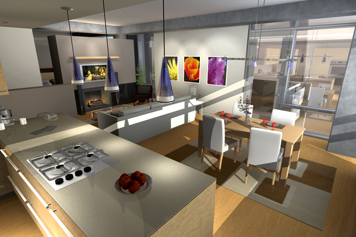
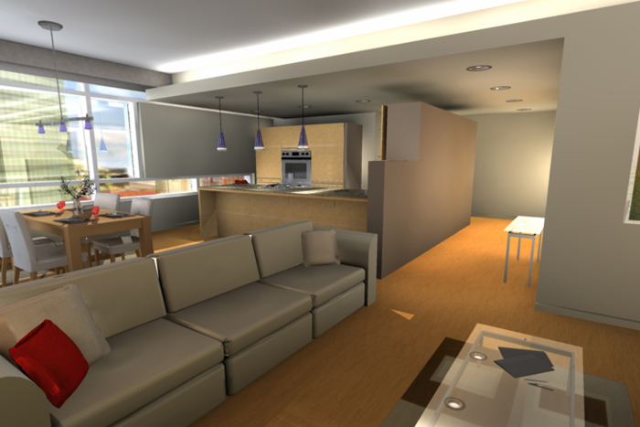
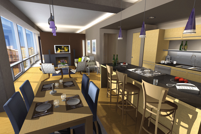
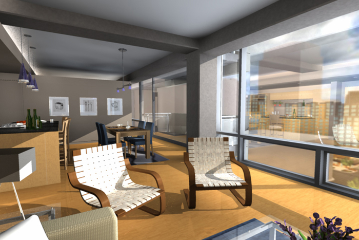
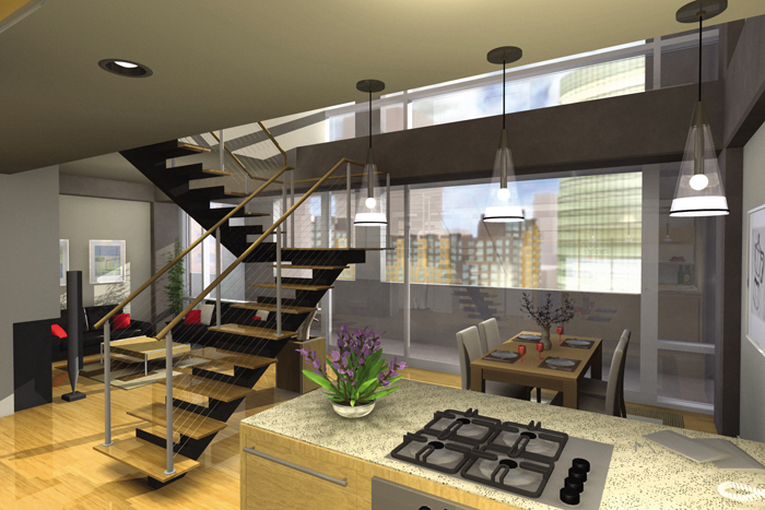
Working closely with shell designer ensured a cohesive and coordinated relationship between the the building’s structure, skin and the interior construction of each unit. Some units were driven by architectural considerations just as some of the architectural elements were driven by the needs of specific units. A glass curtainwall was selected as the skin for the majority of both street elevations, allowing natural light to penetrate the very shallow depth of the “L” shaped condominium skin. Gypsum board elements with integrated lighting and mechanical systems were carefully woven into the core and shell components creating a minimalist composition.
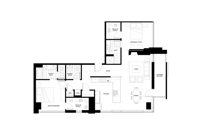
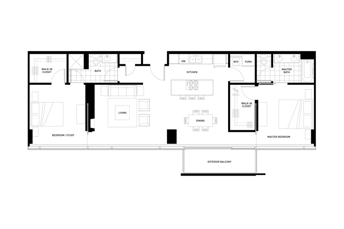
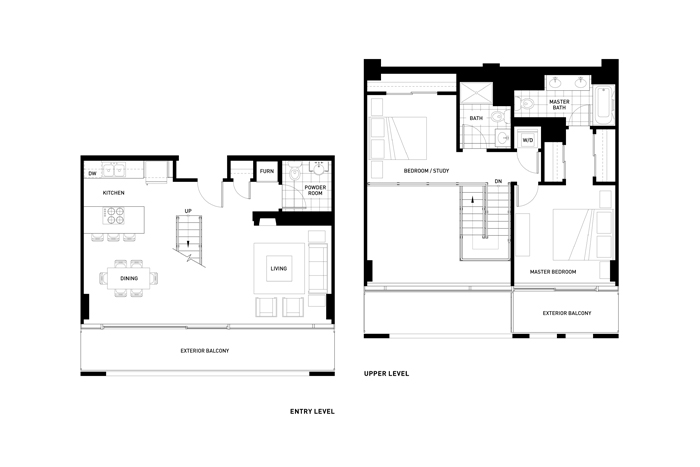
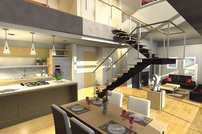
All units are either one or two bedrooms and all include a balcony and fireplace. The primary unit has a bedroom placed at each end, sandwiching the living spaces in the center. All these spaces take advantage of the generous amount of natural light and views at the perimeter of the building, while services are stretched along the corridor side of the unit. One bedroom units and the two bedroom units at the ends of the corridors were derivations of this basic two bedroom unit. A two bedroom two story option satisfied the developer’s wish for a double height volume in some of the units. The configuration of this space and its associated balcony suggested one of the building’s strongest exterior gestures. Particular attention was paid to the organization of the unit that stacks above the corner of Thirteenth and Baltimore. The living spaces were eased into the crux of the “L” and special amenities were allocated, including a more robust kitchen and a powder room.


