Oklahoma City, Oklahoma
Autumn 2010
180,000 SF
Rees Masilionis Turley Architecture LLC (RMTA)
Arhcitect/Interior Architect
LEED Silver Core and Shell
LEED Certified Commercial Interiors
2011 Silver IIDA MADA recipient for Large Office
In 2009 Farmers Insurance began considering sites for a new space to house its existing Oklahoma City call center. The new space was to be a two story build-to-suit call center with an adjacent data center component. To facilitate a compressed timeline of approximately a year and a half from the start of design to occupancy, the project was divided into core and shell and tenant finish packages. RMT encouraged Farmers to pursue LEED certification for both project components. Team members adopted sustainability as the theme for the project making the primary goal to produce the antithesis of their current, windowless space in a defunct shopping mall.
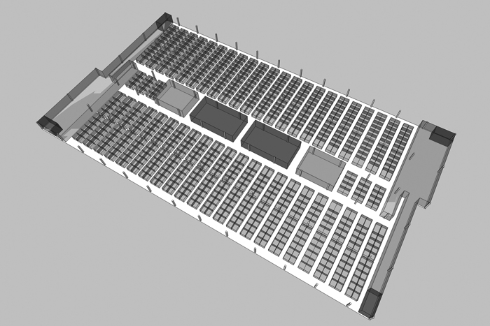
As a liaison between the two design teams, effort was focused on driving the design phase of the core and shell component with information gained in the programming phase of the tenant finish component. The program included smaller, isolated work groups and training spaces on the entry floor and an open call center space on the upper floor. Other givens included a schedule driven decision to use tilt-up concrete as the primary enclosure material as well as the very large parking requirement inherent to call center facilities.
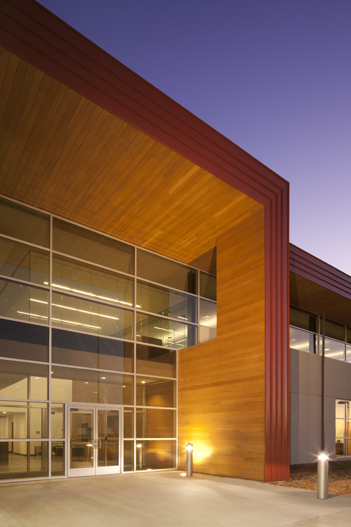
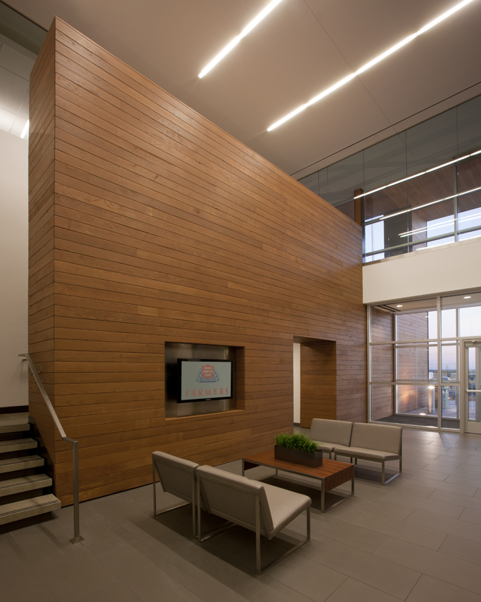
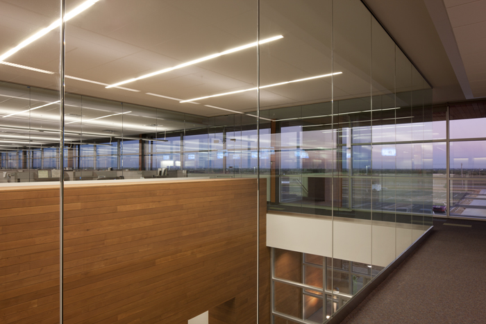
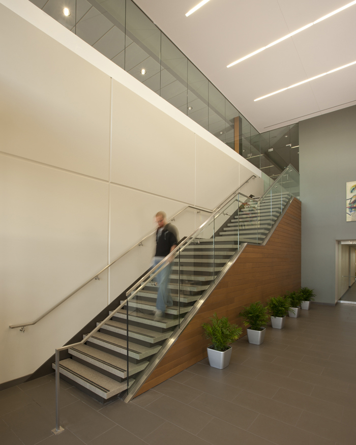
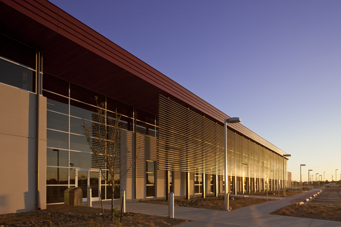
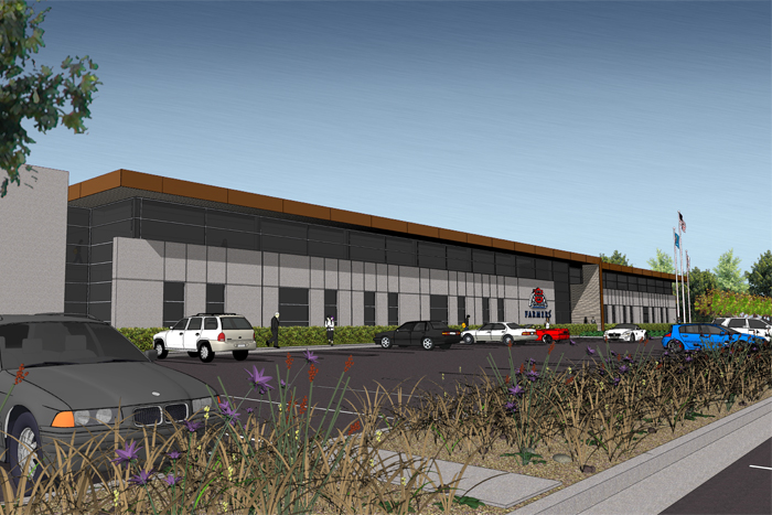
The building mass, stretched as far as possible on its east/west axis, divided the site into north and south parking areas. Early furniture and program studies shaped the overall building configuration and fenestration strategy. Tilt-up panels were held down on the north and south sides to allow for a ribbon window at the call center spaces while full height material punched with narrow windows surrounds the break spaces that “bookend” the building’s east and west sides. Daylight and views were a major goal of the design. To control daylight and mitigate glare the design team employed the use of large, wood clad overhangs and steel screen elements on the south side as well as vertical fins on the east and west. The native burr oak cladding on the overhang folds its way into the interior entry volumes creating interesting spaces that encourage vertical circulation via the stairs. Preferred design elements lost in the process included weathering steel cladding for the vertical face of the building’s brow element and vertical shading devices of concrete that were to be integrated into the east and west tilt-up panels.


